A Composite Landmark, 2015
“A Composite Landmark”
Adam Yarinsky
“On the basis of careful consideration of the history, the architecture and other features of this building, the Landmarks Preservation Commission finds that the 21 East 70th Street House has a special character, special historical and aesthetic interest and value as part of the development, heritage and cultural characteristics of New York City.”
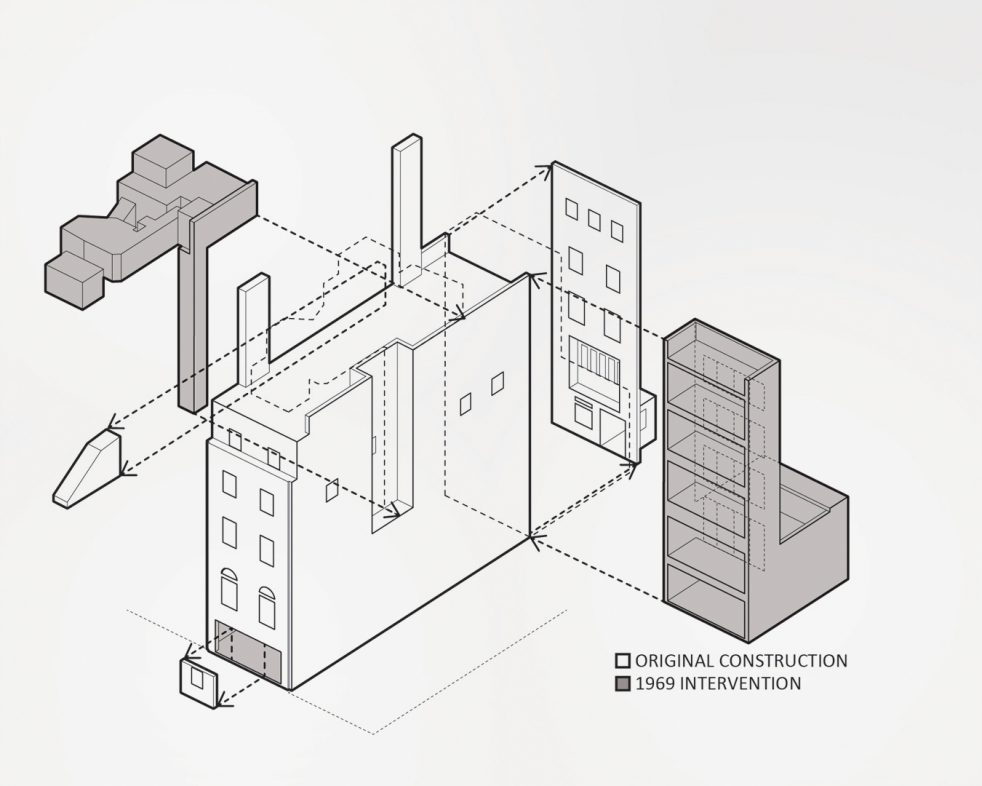
In 2011, Architecture Research Office was selected to design the new home for the Vilcek Foundation, an organization that raises public awareness of the contributions of immigrants to the sciences, arts, and culture in the United States. An exhibition gallery, administrative offices and director’s apartment were the major program elements. The site was a five-story residence located at 21 East 70th Street which was constructed in 1919 and extensively modified in 1969 when it became a commercial art gallery. This renovation, which included removing the entire ground floor façade and inserting a recessed glass entry, made the edifice an uneasy amalgam of two distinct architectures. Disregarding its condition, the fledgling Landmarks Preservation Commission designated the building a landmark in 1974, noting only its “elegance and calculated restraint” as part of an ensemble of early twentieth century neoclassical homes that defined the character of the block. In order to advance the Foundation’s mission and identity, our design transformed the modern alterations and expanded upon their spatial implications to create a more coherent relationship with the original architecture.
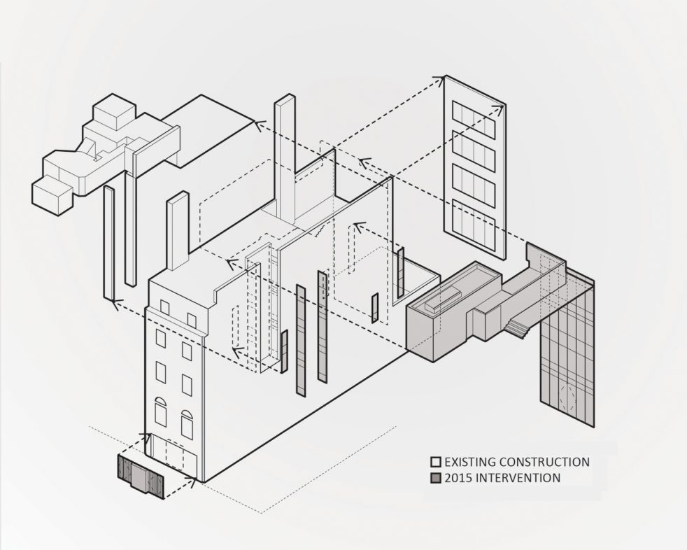
The scope of the project included excavating the cellar several feet, lowering the entire ground floor to align with the sidewalk, constructing a new vertical circulation core and many other changes that improve daylight, views and movement throughout. The design also proposed major exterior alterations, which required the Commission’s approval. Within the entry void, a single marble infill panel flanked by glass doors with bronze grilles restored scale and detail, while still providing a clear connection to the gallery from the street. These new elements also correlated the entry to the composition of the original facade above. In place of the existing floor-to-ceiling windows from 1969, a new curtain wall filled the entire north elevation between bearing walls, defining the building as a planar composition as well as an enclosed masonry volume. The prosaic lot-line windows on the side elevation to Madison Avenue were re-composed. By presenting the design as a totality grounded in the building’s existing hybrid character, the project was unequivocally approved at its first public hearing before the Commission. This was a significant achievement, especially given the sensitivity of the neighborhood, the prominence of the building and its landmark status.
What made our design compelling to the Commission and what larger example might this project offer? The design conveys significance upon the building’s two histories as reciprocal parts of an integrated whole. As a relational strategy that simultaneously embodies permanence and change, this approach to preservation offers experiential and conceptual intensity not possible in an entirely new structure. Conceived as a composite, this landmark registers and shapes the evolving cultural context of the city.

